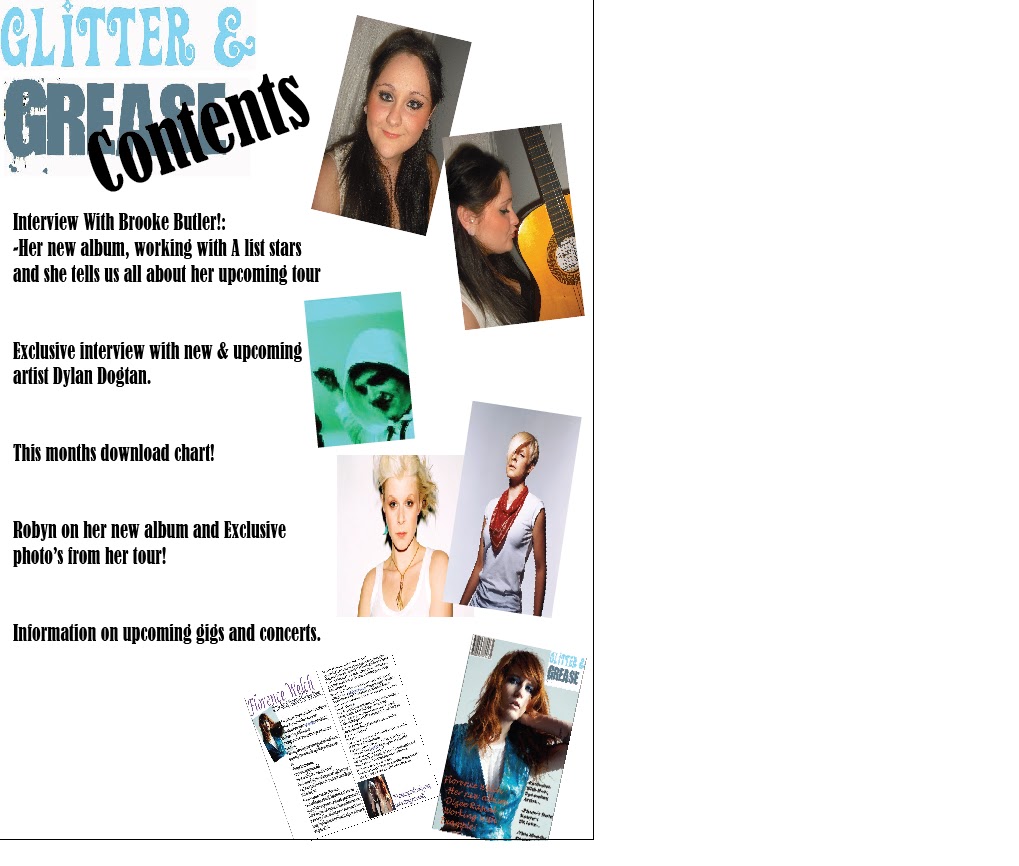
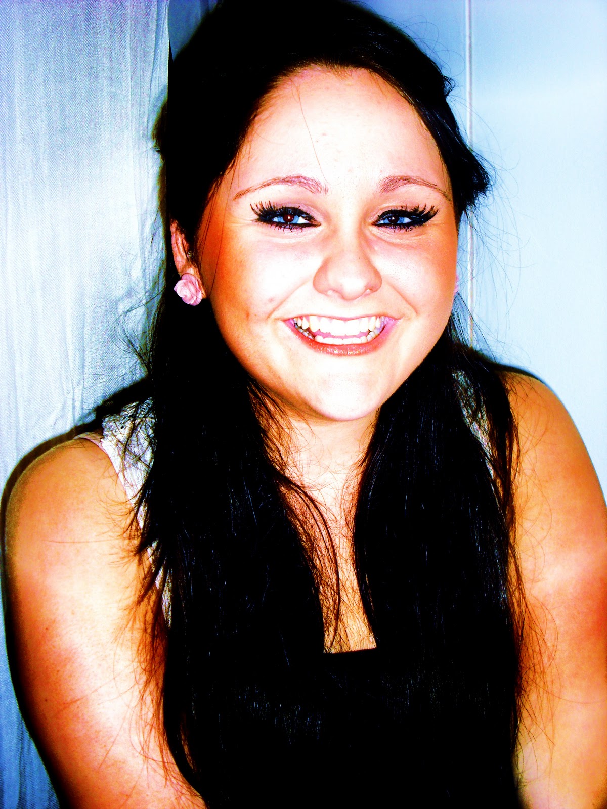
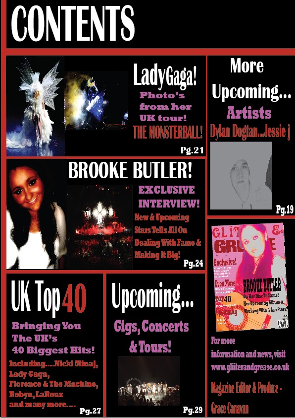
As part of the coursework for this unit, I had to analyse two music magazine front covers which included NME and Kerrang!, with these I had to write about the way things were laid out and the way in which text, colours and other things were used. This helped me to design and produce my own music magazine front cover. I placed my title at the top of the front cover with the main image in front, covering the title; this was inspired by the very well known ‘rolling stones’ magazine. I also stuck to a 4 colour scheme front cover; the colours were white, black, pink and red, this makes the front cover effective and it follows the conventions of existing magazines. The colours I used were bright and eye catching which will make the magazine stand out. The main image was taken as a mid shot to show the posture and the equipment used in the photo. The image is a direct address to the audience which makes them connect with the people looking at the magazine. The anchorage text is black and bold which makes it stand out against the main images; it informs the audience of what will be in the magazine and why this artist in particular is featured. The puffs on my front cover are white and red which make them stand out on the pink background; this will catch the audience’s attention because it makes the magazine look bright and colourful. The main part of the puffs is the title which I have made red, big and bold because when the audience see ‘EXCLUSIVE’ they will want to know the rest and it will attract their attention. This was all inspired by existing magazine covers as they know how to attract the attention of customers and know how to make people buy the magazine.
How does your magazine represent particular social groups? My magazine is aimed at girls aged 16-18 as they are still young and I know what they find interesting. I have aimed my music magazine at girls who enjoy indie pop music; it is fun but unique in its own ways. The way in which my magazine represents the target group is by the colours. They are bright, young and fun like my target group but they are different and unique to other magazine which makes the magazine stand out. This is also a way to describe my target audience as they will be young girls who like to have fun and they are normally unique individuals, it would also be a way of reflecting my target audiences personality, it is aimed at people who like to stand out which means my magazine will appeal to them as it will stand out against other magazines. It is also a way to describe the genre of music that this magazine represents, most music magazines are of one genre but my magazine is two genre’s in one, a mix up and unique style of music and different genres such as Indie and Pop.
What kind of media institution might distribute you music magazine and why? Bauer would be the best publishing company to distribute my magazine; they publish a wide range of media that is both mainstream and niche. They produce a wide range of popular magazines aimed at young women. This is good for my magazine as it is targeted at young women. Having Bauer as the distributor for my magazine will mean that my magazine will be associated with the popular magazine’s that Bauer distribute such as ‘Grazia, Closer and Heat’. Bauer also distribute music magazines, one of there most popular magazines is Kerrang!, the magazine is very well known and it is aimed at a similar audience as my magazine. This will help my magazine get a bigger audience and will enable the magazine to become more well known.
Who would be the audience for your music magazine and why? The audience for my media product is girls aged between 16 and 18 who like indie-pop music. I have chosen to aim my magazine at this age group because I understand what appeals to them and I know what they will find interesting. My target group are young and like to have fun so I have attempted to reflect this in my magazine with the artist that I have used and the stories that I have included, the colours and photographs included in my magazine also reflect the personality’s and lifestyle of my target audience. The colours that I have used relate to us and attract us as a target audience because they are bright and eye catching, they are very girly and make the magazine look unique.
How did you attract/ address your target audience?
I have addressed my target audience by the girly colours that I have included on my front cover, it is bright and eye catching and is appealing to girls aged between 16 and 18. Another way in which I have addressed my target audience is with the main image, the artist ‘Brooke Butler’ is young and pretty and would be an inspirational figure to young girls as she is famous. This is a way in attracting my target audience because they will want to know who she is and they will want to know things about her. I have also used bright and appealing colours that will attract my target audience as girls, all young girls find the colour pink attractive and it will stand out when up against other magazines. The bold puffs and cover line story are also a way to attract and address the target audience as the biggest and boldest parts of the story are the parts that leave people wanting to know more. These are all ways in which I have made my magazine appeal and address my target audience.
What have you learnt about technologies from the process of constructing your music magazine?From producing my music magazine I have gained knowledge in using Adobe software such as Photoshop and Illustrator. I have learnt how to select certain parts of images and change the background of them to suit my magazine colour scheme and to make the image look more professional. As a photography student I already had some knowledge of Photoshop but using it to edit my magazine photo’s enabled me to increase my skills further. I also gained knowledge in using Adobe Illustrator, having never used it before I have become confident in using the programme when producing things like magazine covers and other magazine pages. I will now be confident in the future to used Adobe programmes when producing things in media lessons, I know how to use most things on the programme and I can use them successfully.
Looking back at your preliminary task, what do you feel you have learnt in the progression from it to the full product?

 From the preliminary task that I completed at the beginning of the course I have learnt many things about attracting the target audience, colour schemes, camera angle, organisation and much more. To attract the target audience you need to research them and find out things about them if you don’t already know. I produced a questionnaire for my target audience to find out what colours they would find appealing and what type of artist they would prefer on the front cover of a magazine. This helped me to produce a more accurate magazine for my target audience. In between the preliminary task and making my final magazine I did loads of research on other magazines and analysed them which helped me when producing my magazine. Camera angle is very important on a magazine front cover as I had learnt from looking at recent magazine front covers. My main image on my front cover is a close up, it enables the target audience to see as much as they need to, they are able to see the body language of the artist but the image is still appealing and attractive to the target audience. I have also learnt about the organisation and presentation of magazine front covers and inside pages, having puffs on the front cover with big bold words are a way of attracting attention. Colours are also important as part of presentation, boring dull colours will not help the magazine sell.
As part of my production for my magazine ‘Glitter & Grease’ I have researched two magazines of different genre’s which helped me both produce and improve on my magazine front cover, contents page and double page spread. I believe that I have produced my magazine to the best of my ability and I believe that my magazine is successful as an indie pop magazine and successfully aimed at girls aged 16-18. Although I think my magazine is successful, I also think that with the knowledge I have gained in Adobe programmes I could have made my magazine look more professional. I am happy with the outcome of my magazine but I do believe that if I had practiced more with Photoshop and other Adobe programmes then my magazine would look more professional.


